Main menu shortcut Go to body text

Group Brand Identity

Corporate Identity(CI)

Inspired by a waving flag, the Corporate Identity (CI) reflects KT’s stature as a global brand.
KT Red represents passion, innovation, and a warm, customer-centric spirit, while KT Black symbolizes trust.

KT Brand Color

The core color system clearly reflects the KT Group’s character and direction.
Centered on KT Red, it creates a unified tone and manner across all touchpoints, supported by Matching Color.

  • kt. kt ci red, CMYK 0 100 100 0,RGB 255 0 0,#ED2024,PANTONE 1795 C. kt black, CMYK 0 0 0 100,RGB 0 0 0,#000000,PANTONE BLACK C
  • primary color kt ci red, HEX #FE2E36, RGB 254 46 54, CMYK 0 98 92 0. matching color kt purple #AA50FF, kt blue #00A5FF, kt teal #00BEAC. monotone kt black #000000, kt dark gray #4C4C4E, kt light gray #A2A4A3, kt white #ffffff

Visual Identity(VI)

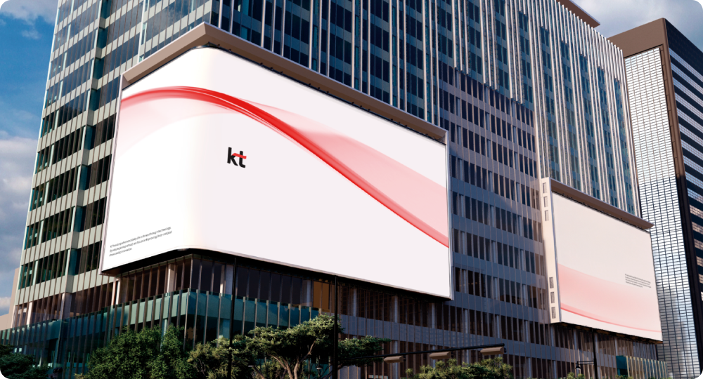
Intelligent Flow, a New Flow Shaped by KT

With every technological shift, KT Group has opened up new possibilities for everyday life.
The Group’s Visual Identity is a modern reinterpretation of the KT CI,
expressing KT Group’s leadership and identity as a brand that has consistently led change.

At the heart of the visual system is "Intelligent Flow," a graphic motif that distills KT's identity.
Through a three-dimensional graphic system, it creates a brand image that is both flexible and scalable.

The building where kt identity is being expressed through external video Design products such as cars wrapped with kt identity, AX Platform Company, notebooks wrapped with kt identity, pencils, paperweight, postcards, etc The Glass products wrapped with kt identity, AX Platform Company

KT Flow Typeface

Inspired by the solid square frame of the KT CI,
KT Flow expresses the Group’s professionalism through its outer form.
The outward-expanding motion of the CI is expressed at the junctions where two strokes meet,
visually conveying continuity and flexibility.

KT Gwanghwamun sign with KT Flow, KT letters AX Platform Company with KT Flow An image that points to 1 on the k part of the logo, 2 on the upper left of t, and 3 on the bent part of t 1 A new flow created through varying curvatures. 2 A geometric structure that harmonizes straight lines and curves. 3 Rounded details in the upper-left and lower-right corners

Each weight has been carefully refined to express
KT’s distinctive character across a wide range of media and touchpoints, while ensuring excellent readability.

  • The Upper A character by kt flow black, kt flow bold, kt flow medium, kt flow thin
  • AX Platform Company KT character list by kt flow black, heavy, bold, semibold, medium, regular, light, thin. Second Half 2026 Variable Font Expansion