Corporate Typeface
Corporate Typeface
Philosophy and Commitment contained in familiar kt name
KT Corporate Typeface Overview
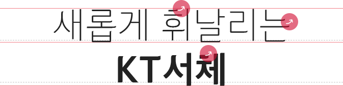
새롭게 휘날리는 KT서체를 만나보세요.
Optimized for digital screens
* Considering the weakness of digital screens of mobiles, tablet PCs, etc., KT fonts changed curves to straight lines to make sure that the text is large and clear enough on a small screen.
hangul typography before optimized, after optimized
Strengthened readability by improving text line-up
* For better communication with customers, we improved the readability by changing the existing non-square frame font to a square-frame font and by reducing empty spaces left as a result of the height in text.
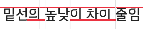 Before
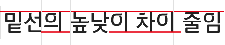 After
After
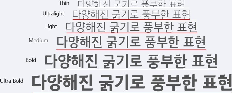
Improved convenience through the diversification of the font-weight
* To enable flexible usage ‘KT font’ consists of 6 weights; Light, Medium, Bold, Extra Bold, Thin and Ultralight
KT Font International Design Prize Awarded History
- Red Dot Design Award Winner in typography design
- iF Design Award Winner in typography design
-
Korean Typography Association
Winner in ‘best font to remember’
Winner in ‘best font to use’
Winner in ‘best font to represent company image’